.png)
.png)

In our last blog, we laid out the core problem: most Sprinklr programs are not struggling with data, they are struggling with attention. Reports get built and sent, and then they disappear into inboxes no one opens or dashboards no one visits.
We also introduced the seven-step Dashboard-to-Decision framework that Premium Blend uses to diagnose where that breakdown happens, from defining the audience and the decision all the way through to format, distribution, and action.
If you missed Part 1, catch it here before reading on.
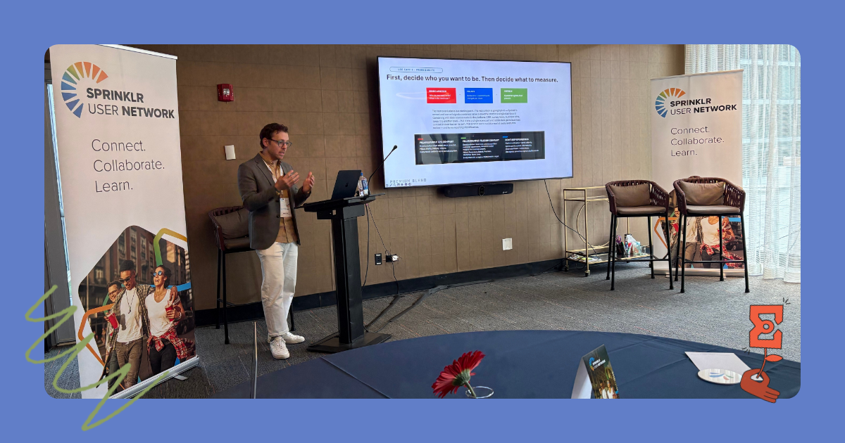
This week, we are getting into the part of Jared's SUN Chicago session that drew the most energy from the room: concrete examples of how brands are already solving the distribution problem, and a framework for building the kind of shared scorecard that makes social data visible at every level of the organization.
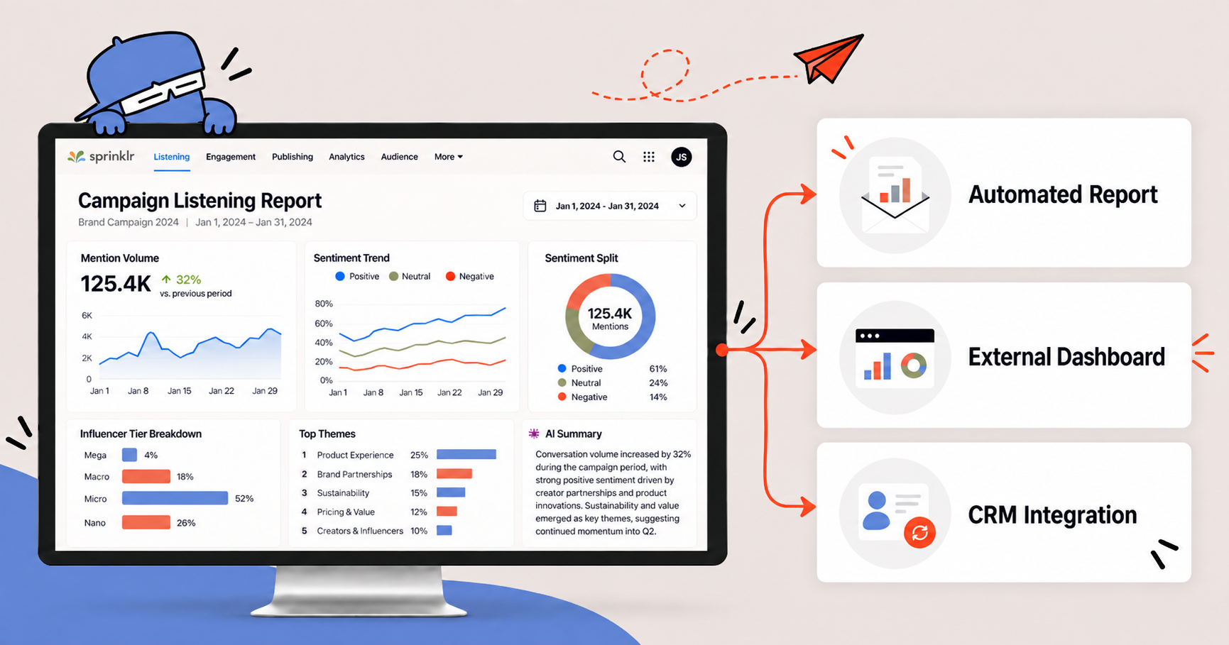
The first use case tackles a reality every Sprinklr program eventually hits: many of the people who need your data will never open the platform. Premium Blend frames this as a delivery spectrum with three practical levels, each suited to a different kind of stakeholder.
Level 1: Automated reports. Scheduled, templated outputs pushed directly into someone's inbox, no login required. Think email newsletters, scheduled exports, automated alerts. Best suited to operational teams that need a routine, high-volume cadence.
A concrete example: monitoring influencer activity during a sweepstakes or sponsorship activation (a World Cup, a Super Bowl, a major campaign). The setup runs in five steps: build a listening topic that captures every campaign mention, layer in influencer tiers (mega, macro, micro, nano) to separate contracted creators from organic participation, configure a scheduled report on a weekly cadence, let it land automatically in exec inboxes, and anchor it with a recurring internal review call. The heavy lift happens once, up front. After that, no one has to ask for anything, and no analyst time is spent rebuilding it each week.

Level 2: External dashboards. Live data surfaced through a shared link, inside tools stakeholders already use, with no Sprinklr login needed. Best suited to managers and directors who want to self-serve on demand.
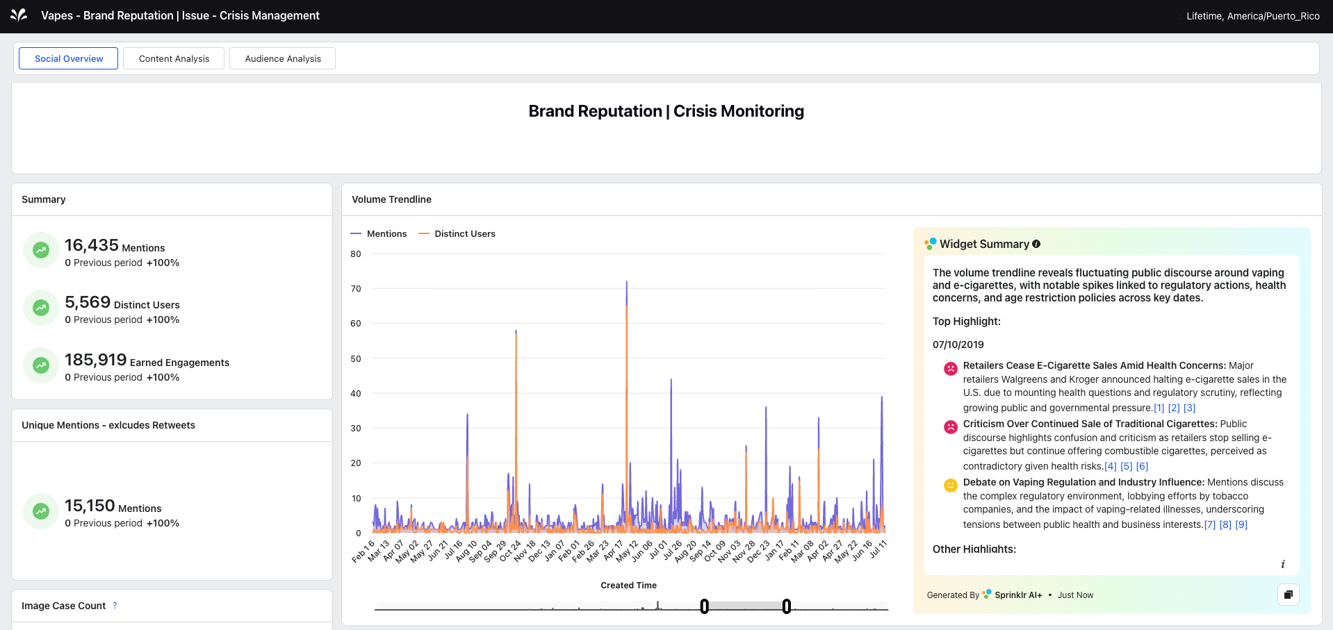
The example here is a brand crisis. An executive's instinct in a crisis is to call for an update every 30 minutes, often before anyone has had time to actually look at the data. A crisis-ready external dashboard solves this: one URL, real-time sentiment trend, mention volume, and top themes, with no waiting on a call. Two design principles matter for this to work. First, every widget needs to tell a complete story on its own, since external viewers cannot filter or drill down. Second, layering in an AI summary widget translates raw data into plain language an executive can trust at a glance, which is the difference between a dashboard people skim past and one they actually rely on.
Level 3: CRM and platform integration. Sprinklr data flowing directly into Salesforce, ServiceNow, or another system of record, meeting people inside their existing workflow. Best suited to leadership, sales, or care teams where the context is high-value and decision-specific.
The example: a store manager who will never log into a listening platform, but whose Salesforce homepage could surface a review flagging bathroom cleanliness, or an employee callout, the same morning it is posted. The insight itself does not change. What changes is where it shows up. For a frontline manager, that is the difference between catching a pattern early and watching it slowly erode customer trust.
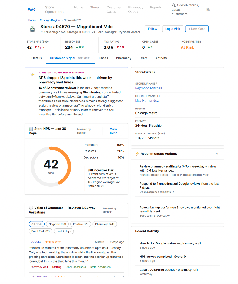
There is no single right answer across these three levels. The right way is the one that actually works for that specific audience.
Whichever level of the delivery spectrum fits a given stakeholder — automated reports, an external dashboard, or a direct line into Salesforce — the goal is the same: insight that reaches someone who can act on it, in a place they already work. That is what turns Sprinklr from a listening tool into a business tool.
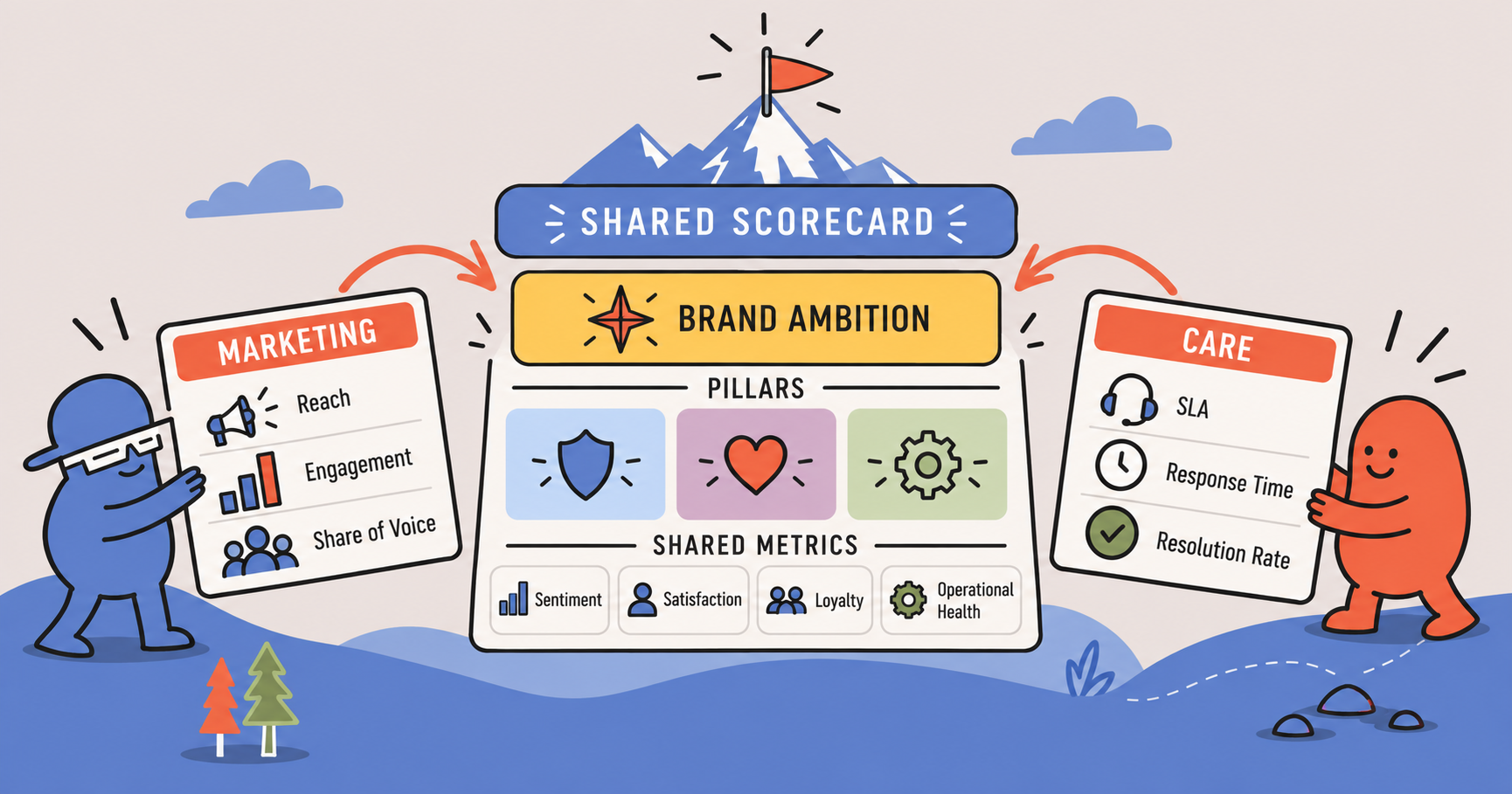
But solving distribution only closes half the attention gap Jared described in Part 1. Even when a report lands in the right inbox, it can still speak a language only the team who built it understands. Marketing reads share of voice. Care reads SLA. When two teams don’t operate from the same scorecard, social data stays siloed at the team level instead of becoming something leadership rallies around.
That is where we pick up next. In Part 3, we will walk through the framework Premium Blend uses to build shared metrics between marketing and care — starting with one question most teams skip before they build anything: who do you want to be as a brand? We will look at how a CPG brand and a major telecom each turned that question into a scorecard that finally gave social data a seat at the executive table.
Stay tuned for Part 3, the final piece of the framework: turning distributed data into a metric everyone in the room actually owns.